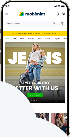
Most webpages fail before the user scrolls because they hide the actual value proposition behind a slow-loading hero image or a vague, clever headline. If a visitor cannot understand exactly what you offer within the first three seconds, they click the back button. It is a simple truth that causes massive revenue loss for thousands of ecommerce stores.
The Myth of the Fold
Many designers believe the fold is a hard technical limit where users decide to leave. They argue that if a call to action is not visible on a 13-inch laptop screen, nobody will ever find it. This has led to cramped landing pages where buttons are squeezed into the header alongside massive lifestyle photos. The reality is that users do not mind scrolling if they find value in the content. People scroll past the fold all day long on social media and news sites. They abandon a page not because it is long, but because it feels hollow or irrelevant from the very first glance.
The First Three Seconds Define Success
The main reason for immediate abandonment is cognitive friction. A user arrives from a Facebook ad or a Google search expecting to find a specific product or answer. If the hero section is filled with abstract art or a generic promise like “Join our movement,” the user feels lost. Every millisecond of delay while waiting for high-resolution background assets to load gives the visitor a reason to bounce.
Defining the Above-the-Fold Priority
Your goal at the top of the page should be clarity over creativity. A visitor needs to see the product name, a high-quality image of the item in use, and a clear reason to stay. If you sell specialized coffee beans, the header should feature the beans. It should not be a photo of a sunrise over a field where the text is impossible to read.
Your above-the-fold content is not an advertising billboard; it is an orientation map for the user.
Performance Metrics and Bounce Rates
Data from providers like Google show that bounce rates climb sharply as page load times cross the two-second threshold. If your hero image is a 5MB PNG file, you are essentially paying for visitors to leave your site before they ever see your inventory. Optimization is not just a technical task for developers. It is a fundamental part of the shopping experience that directly influences your bottom line.
Standard Performance benchmarks
- Under 1.5 seconds: Ideal performance for mobile traffic.
- 2 to 3 seconds: Noticeable decline in conversion rate.
- Over 5 seconds: Expect a bounce rate higher than 50 percent.
- Mobile network latency: Usually adds 200-500ms even on fast sites.
- Image compression: Reducing file sizes by 70 percent is common practice.
Visual Clutter and Decision Paralysis
When a page is overloaded with navigation links, pop-ups, and newsletter signup forms before the user has even looked at the product, the brain shuts down. This is known as the paradox of choice. You want to offer options, but you must prioritize the path of least resistance.
Managing On-Site Elements
Effective landing pages use white space as a tool to guide the eye toward the primary call to action. If you have a newsletter signup form that takes up 40 percent of the screen on mobile, you are telling the visitor that your data collection is more important than their shopping journey. Reducing these friction points is a primary goal of tools like our form builder, which ensures that interactions remain focused and lightweight.
Comparing Mobile User Journeys
There is a distinct difference between how a user interacts with a standard mobile browser and a native application experience. Browsers are often plagued by competing tabs and address bars that steal screen real estate.
FeatureMobile WebsiteNative Mobile AppLoading speedVariable based on connectionHigh performance via cacheNavigationAddress bar/browser toolsFull-screen experienceNotificationsLimited/blockedNative push capabilityUser habitTransient browsingRepeat, loyal engagement
Strategies to Improve Engagement
You can fix the “scroll-abandonment” issue by implementing a few structural changes today. Start by testing a different headline that addresses the user’s core problem rather than your company’s mission. Run an A/B test with a static image instead of a heavy video background.
Actionable Fixes
- Limit hero headlines to 10 words or fewer.
- Use button colors that contrast strongly with the background.
- Replace heavy sliders with a single, high-converting product image.
- Remove top-level navigation items that are not directly tied to shopping.
- Include a “why us” bullet point set immediately after the hero.
The Role of Content Architecture
Many stores fail because their content hierarchy is backwards. They bury the pricing, the shipping info, and the return policy deep in the footer. If a customer has to hunt for these details, they become suspicious. Transparency is the antidote to the uncertainty that drives people away before they ever scroll.
Common Mistakes in Layout
The biggest error is assuming that the visitor knows who you are. New visitors have zero loyalty. You have to earn their attention every single time they click through. Do not force them to solve a puzzle to find your “add to cart” button.
Takeaway
Webpage abandonment is usually a result of poor speed or unclear messaging, not an aversion to scrolling. Prioritize loading performance and immediate value proposition to capture interest before the user decides to leave. How are you measuring the specific point where your visitors drop off on your site?