I used to think that a fast-loading Shopify theme was the ultimate fix for mobile drop-offs. We spent weeks optimizing image sizes and minifying scripts for an early partner in the pet supply niche. The site was fast, yet the conversion gap between desktop and mobile wouldn’t budge.
This brand turned one-time buyers into repeat customers with a simple mobile strategy that had nothing to do with server speed. They realized that the mobile web is essentially a broken experience for anyone who has already bought from you once. It is not about the first click, but the tenth.
The myth of the mobile-optimized website
We have been told for a decade that a responsive website is enough. You buy a premium theme, you ensure the buttons are big enough for thumbs, and you call it a day. I followed this playbook religiously when we started building for our first few testers.
The reality is that mobile browsers are designed for discovery, not for shopping. When a customer lands on your site from a Facebook ad, they are trapped inside the Instagram or TikTok “in-app browser.” These browsers are notoriously buggy, often losing cart data or failing to auto-fill credit card information.
A D2C brand we studied recently found that 74% of their mobile traffic was arriving via these social browsers. The friction was immense. Every time a customer wanted to buy a second time, they had to re-type their shipping address and find their wallet. In a world of face-ID, asking a human to type a zip code is a conversion killer.
What we learned from a high-volume apparel brand
One brand doing roughly $80,000 a month in the fitness apparel space noticed a strange trend. Their email open rates were high, but the click-to-purchase rate on mobile was less than 1.2%. They were paying thousands of dollars to bring people back to a site where the user had to log in again.
They shifted their focus. Instead of fighting the limitations of the Safari mobile window, they moved their top 20% of customers into a dedicated space. This wasn’t about reaching more people; it was about making the existing people worth more.
By using push notifications instead of email for their weekly drops, they bypassed the promotions tab entirely. The results were not subtle. Their repeat purchase rate climbed by 32% in the first quarter because the friction of the “re-buy” disappeared. A native environment remembers the user, the size, and the payment method without asking questions.
A mobile website is a storefront you visit; an app is a tool you keep in your pocket.
Comparing the two paths to a purchase
It helps to look at the actual steps a customer takes. We mapped out the journey for a returning customer trying to buy a new product release on a standard mobile site versus a native setup.
Action Step Mobile Website Experience Native App Experience Awareness Email (Buried in Promotions) Push Notification (Lock Screen) Access Click link, wait for browser to load Instant tap, biometrically logged in Checkout Manual entry or third-party login One-tap Apple/Google Pay Retention Requires retargeting ads ($$$) Direct communication ($0)
The table shows the structural disadvantage of the web. The mobile site is a leaky bucket. You are effectively paying Google and Meta to rent access to your own customers over and over again.
The hidden cost of the mobile web
When you look at your Shopify analytics, check your “Returning Customer Rate” by device. Most store owners find that desktop users return at double the rate of mobile users. This isn’t because mobile users are less loyal; it is because the mobile web is annoying to use for more than five minutes.
Baymard Institute research suggests that mobile conversion rates are consistently 50% lower than desktop. We saw this firsthand with a wellness brand selling organic supplements. Their customers wanted to reorder every 30 days, but the mobile site made them feel like they were starting from scratch every time.
The lever of zero-cost retention
If you are doing $50,000 a month, you are likely spending $10,000 to $15,000 on ads. A significant portion of that spend is wasted on people who already know your brand name. They just need a reminder to come back and buy.
Email is getting harder. With the recent changes from Google and Yahoo regarding sender requirements, and the general clutter of the inbox, your message is one of two hundred. Push notifications, when used correctly, operate differently.
- They appear on the lock screen with a 90% plus open rate.
- They allow for deep-linking directly to a specific product collection.
- They don’t require an algorithm to decide if your customer sees the message.
- They facilitate “flash sales” that actually sell out in minutes, not days.
- They build a persistent presence on the home screen next to Instagram and Spotify.
One store owner I spoke with last week realized they were spending $4.00 in SMS fees just to tell a customer their order had shipped. In a native app environment, that cost drops to zero. Over 1,000 orders, that is $4,000 back in the margin.
What to do instead of buying more traffic
The instinct for most founders is to scale top-of-funnel. If sales are flat, we turn up the ad spend. But if your mobile conversion rate is 1.5% while your desktop is 4%, you are effectively lighting money on fire to fill a porous container.
Focus on the middle of the funnel. Look at the people who have already added to cart on mobile but didn’t finish. Often, they got a text message, switched apps, and the mobile browser refreshed, clearing their cart. That is a lost sale that has nothing to do with your product or your pricing.
Instead of another landing page test, try to reduce the number of taps it takes to get from a product page to a “Thank You” screen. Every tap you remove increases the likelihood of the transaction completing. This is why Amazon spent millions on the “1-Click” patent. They knew the friction was the enemy.
Specific levers for growth
We have identified three specific triggers that move the needle for brands between $5k and $200k in monthly revenue. First is the “App-Only” drop. By giving your best customers early access, you create a VIP tier without needing a complex loyalty plugin.
Second is the abandoned cart push. Unlike email, which might be seen four hours later, a push notification can land twenty minutes after a session ends while the phone is still in the customer’s hand. The recovery rate on these is significantly higher than standard automated emails.
Third is the personalized feed. A native app can show products based on previous behavior without the lag of a web-based recommendation engine. It makes the store feel like a curated boutique rather than a generic catalog.
The reality of the transition
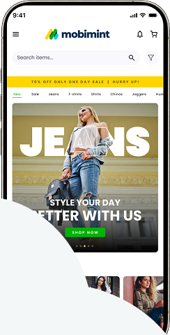
I will be honest: building an app is usually a nightmare. Most agencies want $40,000 and six months to get something live. Then they want a monthly retainer to make sure it doesn’t break when iOS updates. That is why we started Mobimint.
We realized that Shopify and WooCommerce stores already have all the data. The products, the inventory, and the customer records are there. The app just needs to be a high-performance window into that data. We chose to focus on a native build because “hybrid” apps that just wrap a website in a container still feel slow and clunky.
Our goal is to let builders stay builders. You shouldn’t have to worry about Xcode or Android Studio. You should be worried about your supply chain and your creative direction. The tech should just work in the background, capturing the mobile revenue that currently slips through the cracks.
Takeaway
Mobile revenue loss isn’t a traffic problem; it’s a friction problem caused by trying to force a desktop-style web experience into a five-inch screen. When you remove the login hurdles and the browser lag, your repeat purchase rate becomes your biggest growth lever.
Open your Shopify analytics today and compare your Mobile Conversion Rate to your Desktop Conversion Rate to see exactly how much revenue is staying on the table.