partners frequently look for guidance on optimizing and customizing their homepage — after all, it’s the app’s most commonly visited page.
If you’re one of those people, you’re right where you should be.
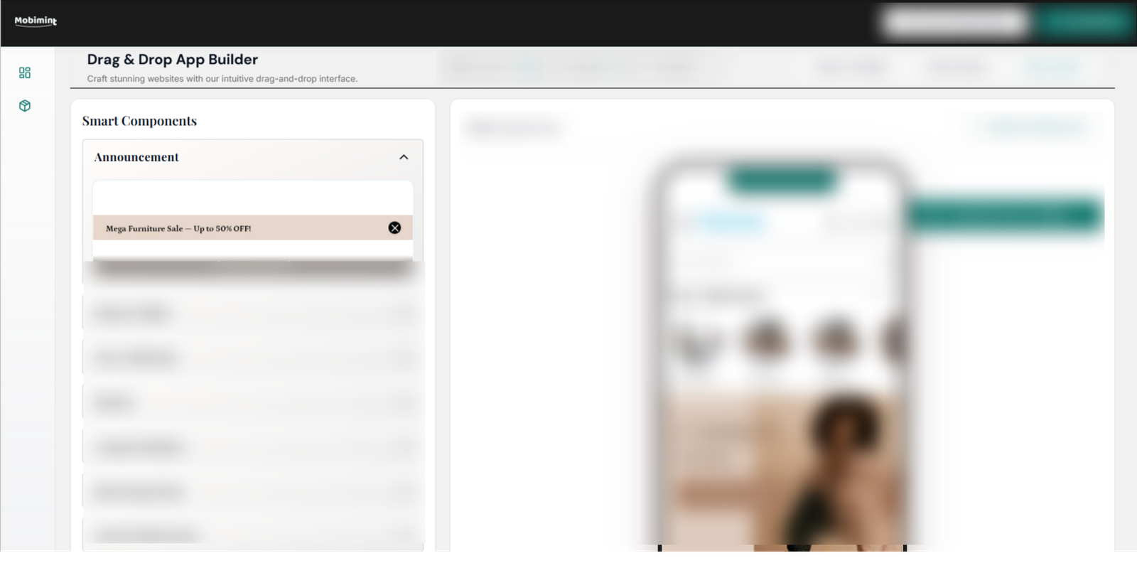
In the Change Content tab of the Design Editor, you’ll have access to various widgets that enhance your app’s design and usability. By using the drag-and-drop controls, you can arrange your homepage exactly the way you want. To begin adding elements, click Theme List at the top of the page.
Let’s take a closer look at what each of these widgets offers.
1. Social Media Feed
With social media being a major part of customers’ lives today, it makes sense to highlight your Instagram content inside your app. You can assign a section of your homepage to display your Instagram posts, ensuring ongoing engagement without extra work. Any update you publish on Instagram will automatically be reflected on your app’s homepage.
Just sign in to Instagram and connect it to your app. Add a nice, attention-grabbing title to this section so your users know what it’s about. You can use any of the examples below:
- Explore on Instagram
- #StayConnected
- Or add one of your frequently used hashtags.
Before moving on, keep in mind that every widget offers top-right configuration tools that allow you to duplicate, hide, set a schedule for, or delete it.
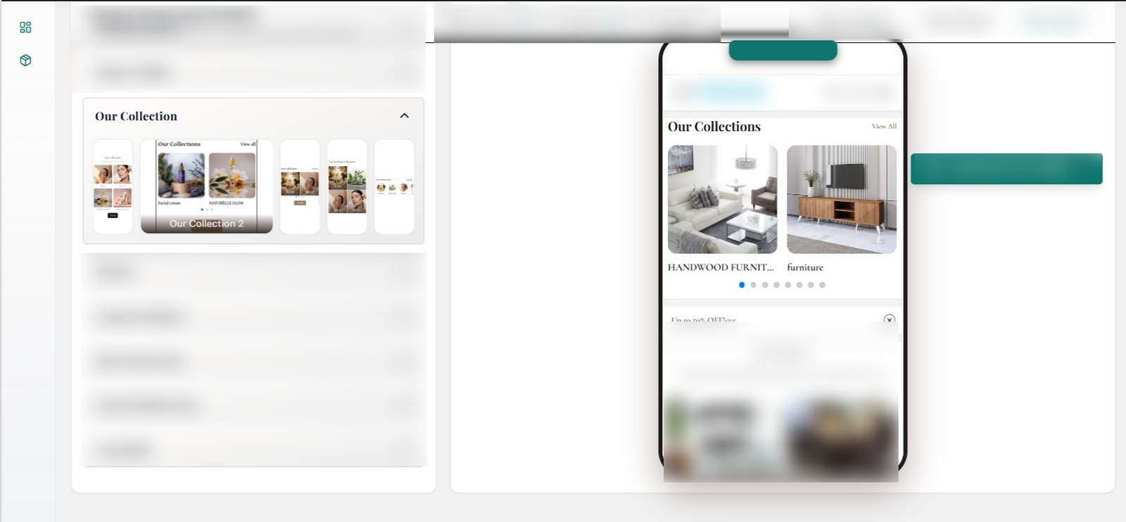
2. Image Gallery with Text
It’s common for brands to use neatly edged, square frames to showcase their collections, and sometimes even individual products. Squares work especially well on mobile screens since the design feels familiar—similar to the shape of most app icons. Each tile can act as a spotlight for any product category you want to feature.
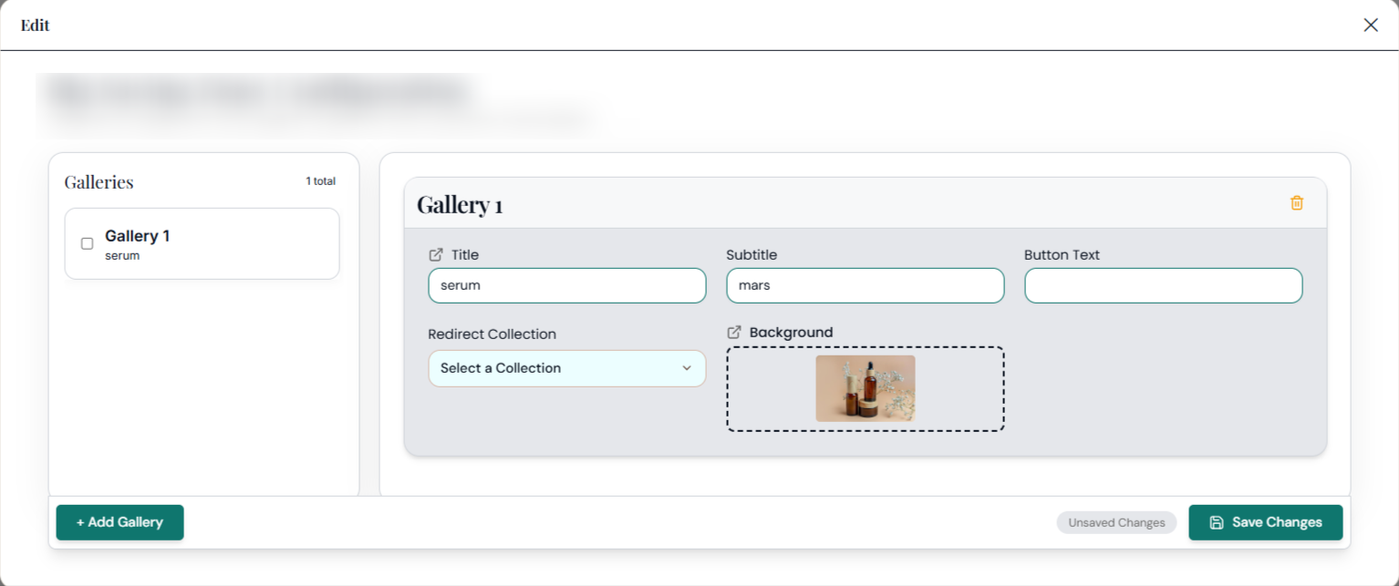
Take a look at the icons on top of the image tiles. These allow you to perform the following actions, in order:
- Upload photos of your products or collections
- Add the URL where you want shoppers to be taken when they click on it.
- Change the sequence of the tiles.
- Remove the tile completely.
3. Product Grid
The product grid is used to show a selection of products, which can come from different collections. Unlike an image grid, there’s no text placed over the photos. Shoppers can simply scroll through the images to explore and choose what they like.
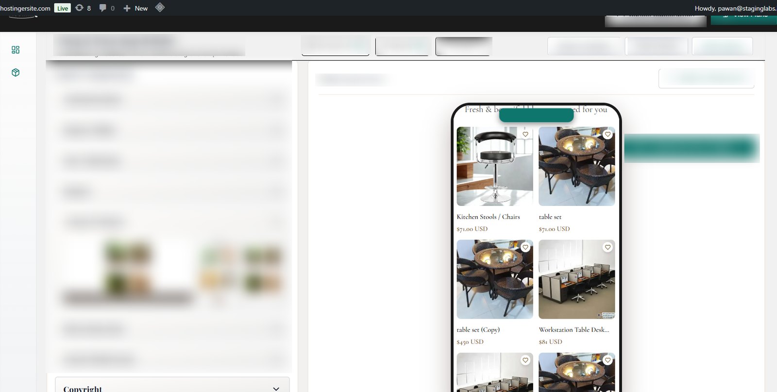
4. Product Slider
The product slider allows customers to move through items by sliding sideways, rather than scrolling vertically like in a product grid. It’s also used to showcase multiple products and can include a link that takes users to the full collection.
Note: customers must scroll themselves to see all the products.
Add a title and pick the collection you want to show, and the section is ready.
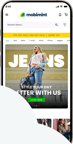
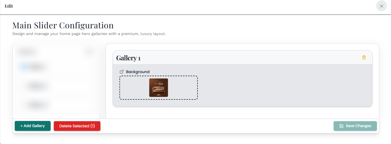
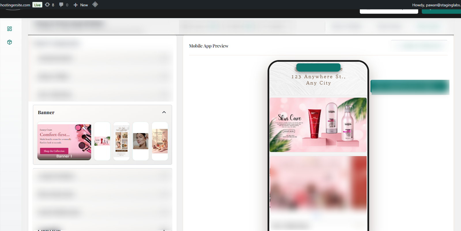
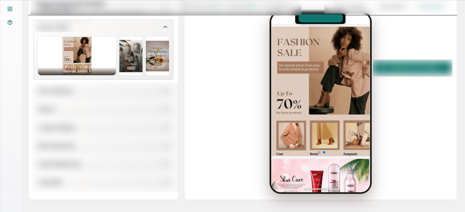
5. Banner Images
Promote sales, deals, new launches, and plenty of other announcements through banner images!
6. Auto Slider Image
Enhancing banner images, this option lets the products move on their own, giving a smooth banner-like effect.
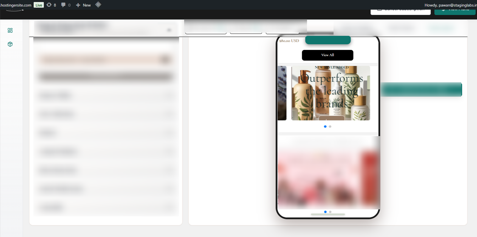
7. Slidable Banner Images
Display a variety of events, sales, and promotions with scrollable banner images.